Rabbit Skins
Rabbit Skins creates comfortable, durable children's clothing that embraces the imaginative world of childhood, allowing kids to play and explore while giving parents peace of mind freely. Their products are designed to be versatile and expressive, fitting any adventure or personality a child might embody.
The goal was to craft a brand identity and website that seamlessly reflects the company’s ethos of joy, wonder, and self-expression.
Branding | Art DirectionThe logo marries nostalgia with whimsy, evoking the charm of classic children's letter blocks. Vibrant, bold typography radiates joy, while soft rounded corners create an inviting aesthetic that appeals to both young and old. A clever touch crowns each "i" with a stylized bunny tail, subtly incorporating the brand's rabbit motif. This playful element does double duty, also resembling a cloud—a nod to the boundless imagination of childhood.
Logo
Logo Variations
This comprehensive layout demonstrates the harmonious interplay of product, imagery, and brand elements. The distinctive bunny tail motif serves dual purposes: as a subtle background pattern in product shots and as framing for images. To achieve visual balance, refined headline typography provides an elegant counterpoint to the vibrant playfulness of the primary logo mark and color palette.
Billboard 


The brand's vibrant online presence is captured through a series of dynamic social media posts. These engaging compositions showcase the lively color palette, feature candid lifestyle imagery of children at play, and cleverly repurpose the logo's bunny tail motif as a playful framing device for images and copy.
Social Media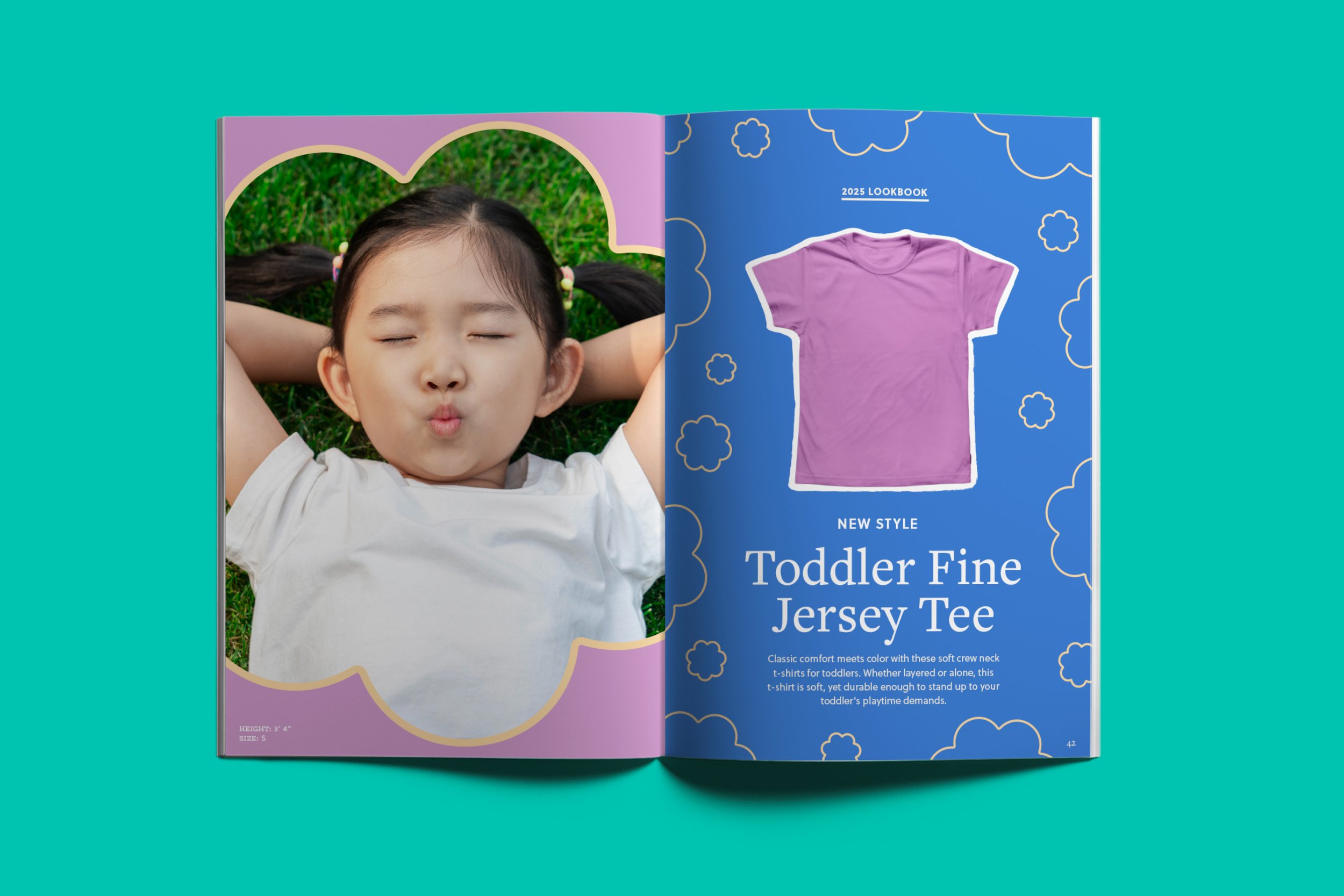

Project created using InDesign, Illustrator, and Photoshop
View More Work