HoneyFront
HoneyFront aspires to be Albany's culinary heartbeat, inviting travelers and locals into a rich Southern dining experience. This project aims to capture the essence of home-cooked precision and soulful hospitality visually, transforming HoneyFront's vibrant menu, expert service, and local character into a captivating digital narrative that celebrates the taste of Southern comfort.
Branding | Art DirectionThe HoneyFront logo embodies the brand's soulful hospitality through a warm, rounded serif typeface. A graceful, honey-inspired curl on the 'H' evokes the smooth, golden essence of honey, creating an inviting and memorable logomark that captures the brand's welcoming spirit.
LogoDesigned to seamlessly adapt across horizontal layouts, vertical compositions, and compact badge formats, ensuring consistent brand representation and visual identity across diverse collateral and marketing materials.
Logo VersatilityA bespoke visual pattern celebrating Albany's culinary heritage and southern hospitality, rendered through hand-illustrated ingredients, cooking tools, and custom typography that warmly captures the essence of home-cooked tradition.
Crafted Branding NarrativeSocial MediaMenu & Brand CollateralTypography NarrativeA deliberate typographic composition echoing the eclectic, memory-rich aesthetic of gallery walls, where diverse typefaces weave together like cherished family photographs collected through generations.
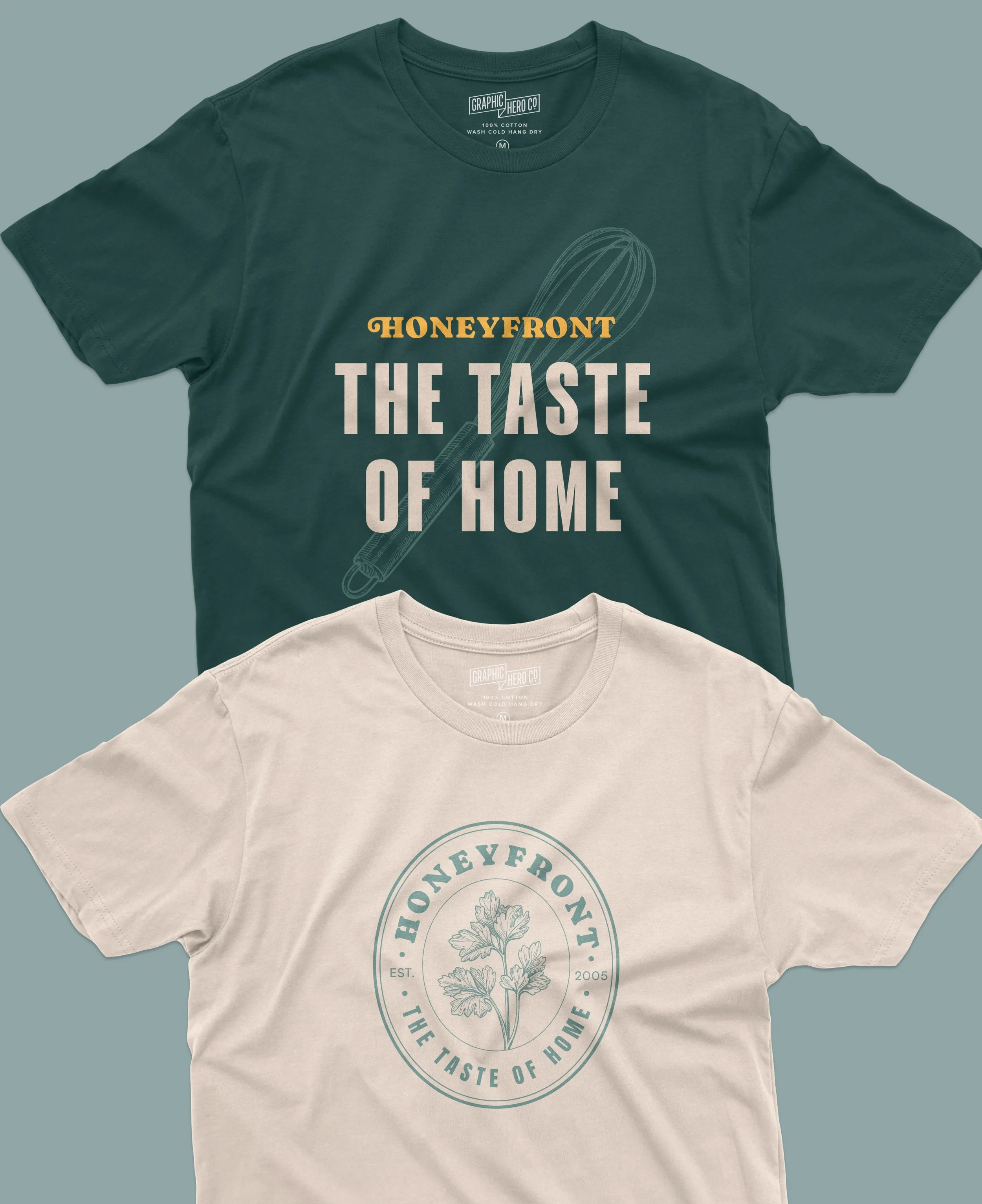
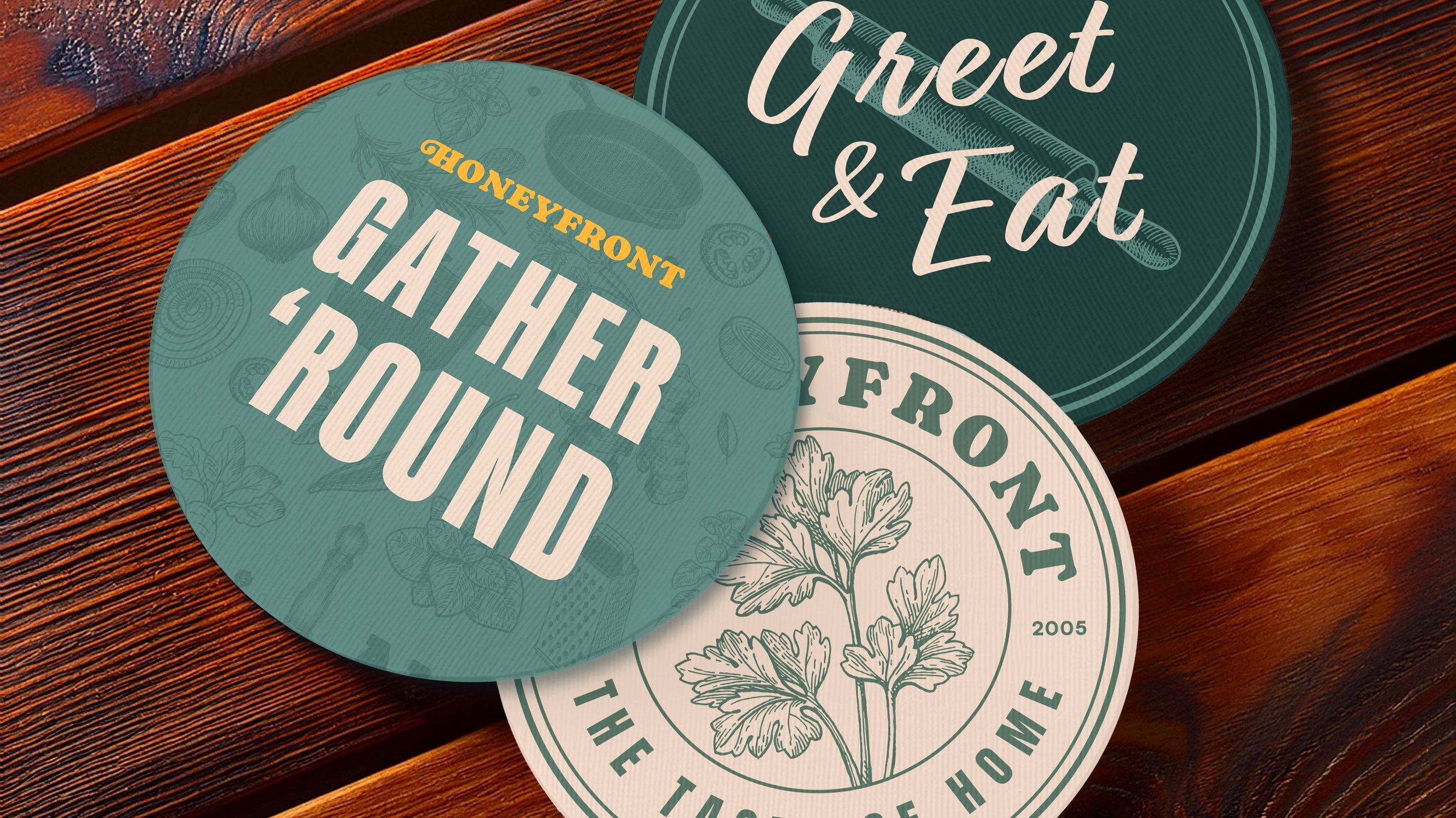
MerchApronCoastersProject created using InDesign, Illustrator, and Photoshop
View More Work


